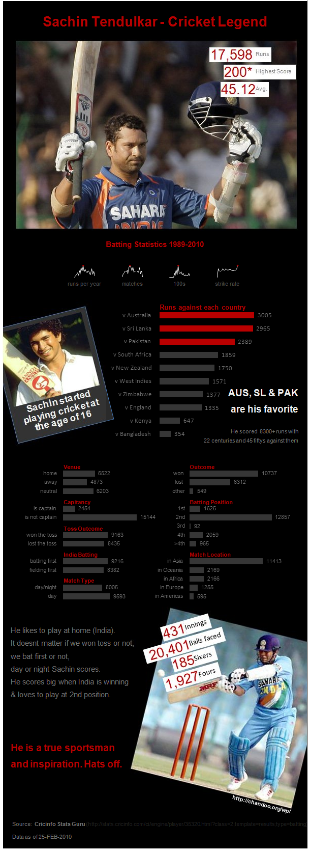
Really excellent examples of Excel Dashboards continue to come from Chandoo, author of Excel Forumla Helper.
Take a look at this infographic-style Excel dashboard. It’s made with Excel 2010 (now with sparklines!).
You can download this excel dashboard from Chandoo’s post: An Excel Info-graphic Poster.
Hubert Lee
The Dashboard Spy


Wow, now I am impressed. Excel has become a live rich-media publishing app, too? This looks like a Photoshop laid out doc. Nice job for a nearly-free BI tool!
Comment by BI Tool Guy — July 29, 2010 @ 1:52 pm
Hey cool dashboard representation of statistics.
Sachin is great
Comment by dMine Dashboards — September 3, 2010 @ 2:40 am